Emerson Write
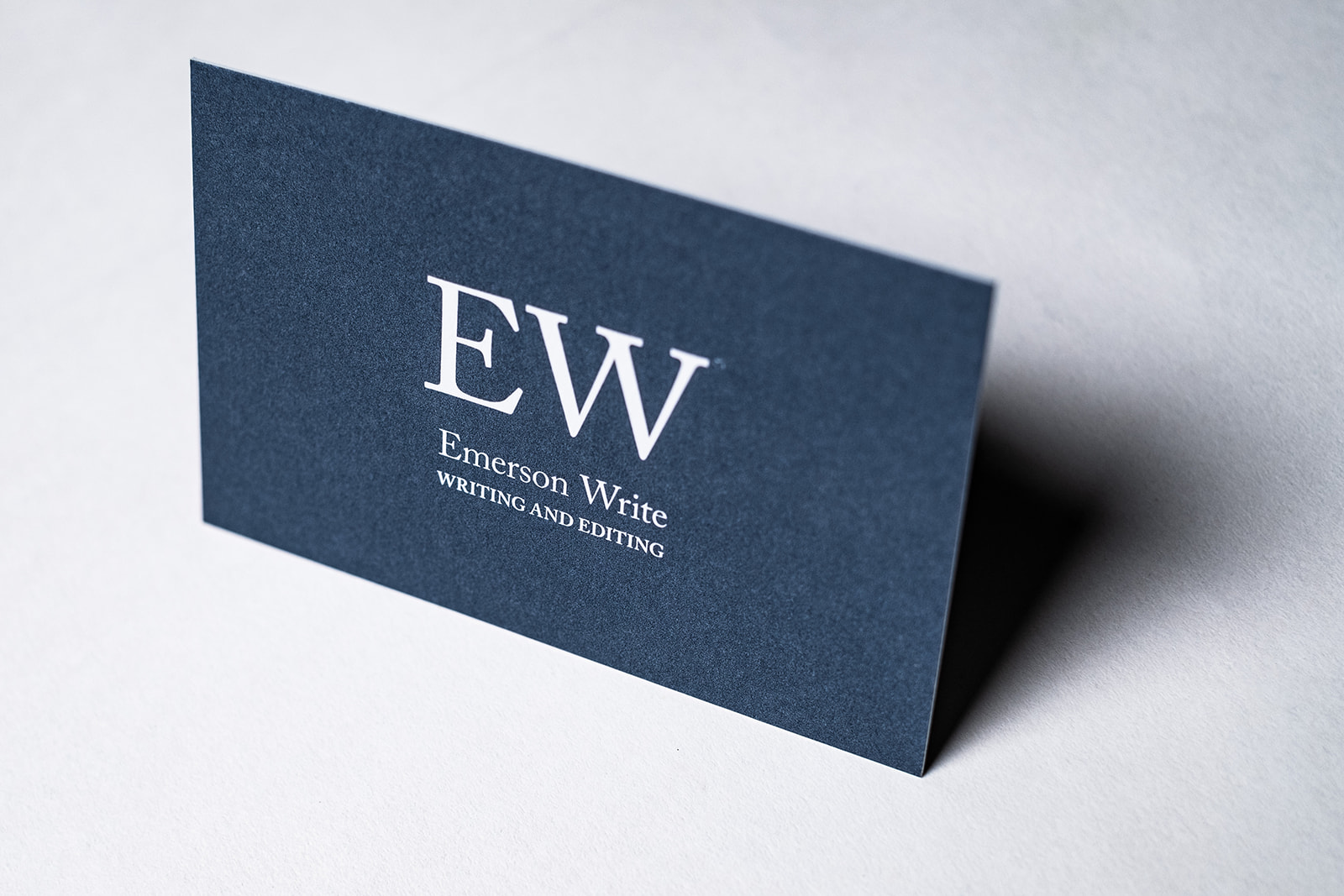
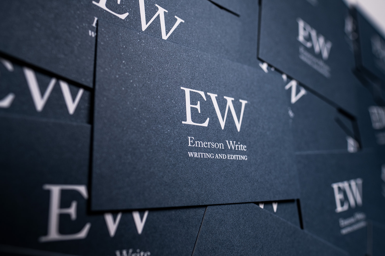
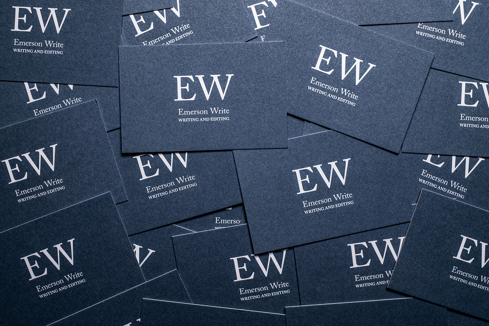
Letters and strong typographic representations of these, were a key design directive for the visual identity for Emerson Write. As the work of Emerson Write is words, it made good sense to make the words and letters central to the identity.
The bold serif and fine structure of the typeface lends itself well to conveying self-assurance, credibility and attention-to-detail; all at the core of the work and service that Emerson Write provides. The dark grey/blue tones of Pantone 5405 suggest self-assertion yet sobering and reassuring, particularly when used as a solid with white-out text.