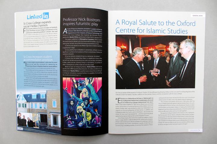
Crossword magazine # 1
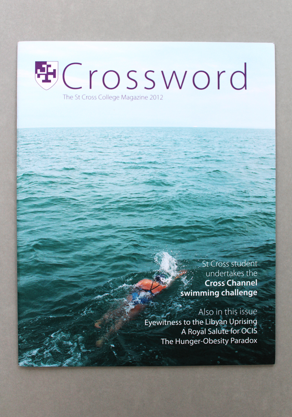
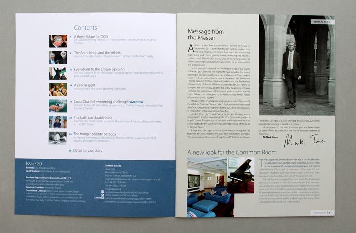
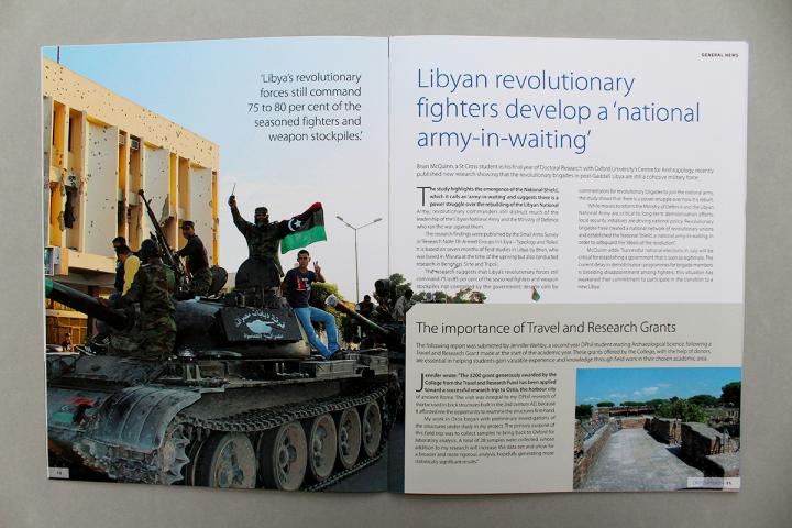
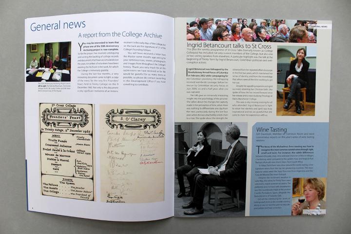
This is the first issue of Crossword that we redesigned for St Cross College, Oxford. It was important to use the St Cross purple as a point of identity and continuity for the College. We then developed a palette of blues and taupes to offset yet complement the striking purple, and to establish a professional and academic visual tone to the publication. The layout design, use of images and selection of fonts work together to communicate the modern, progressive character of the College and its community.
