Rhodes Scholar # 4
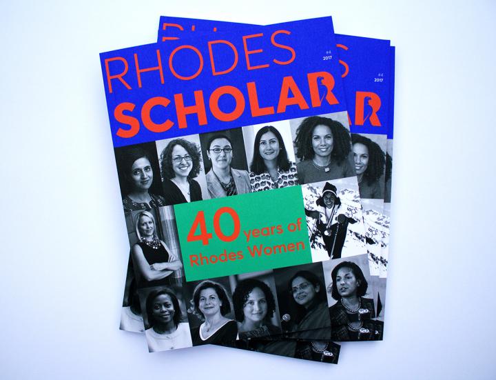
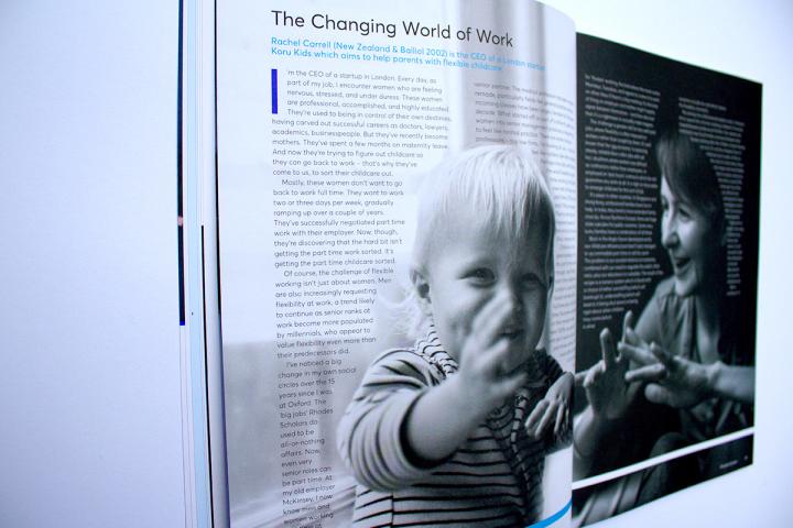
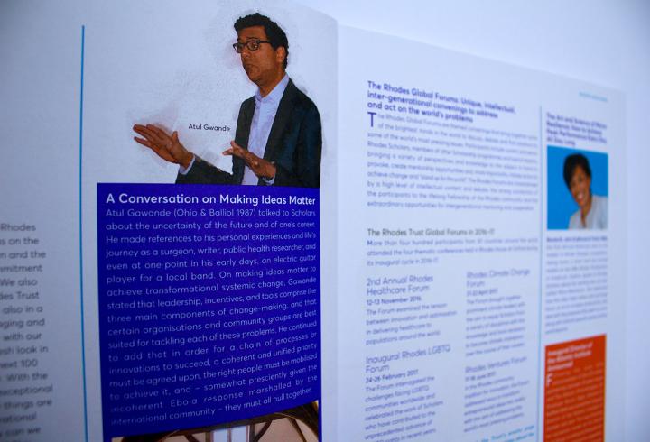
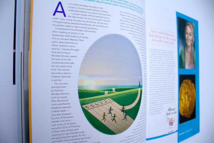
This year's edition of the magazine had a refreshed look, implementing the new visual identity and brand style guide for the Rhodes Trust. The new logo includes the Rhodes bird as integral to the letter 'R' so we included this with the cover title text of the publication. The bold, new colour palette is splashed throughout and has been used to highlight summary decks and other typographic features, footer borders and image enhancing devices. We were commissioned to add editorial illustrations where appropriate and graphic treatments to make each spread distinct, and thus engage the audience with arresting visuals, complementing the copy layout and content.

