Parent handbook
Design and illustration for printed brochure
It can be easy for a handbook for parents to becomes a text-heavy tome, impenetrable text which can lead to confusion rather than clarity. Our design included careful use of white space and negative space to aid navigation, as well as a convenient index: just a contents page did not offer a quick and easy source of reference for parents.
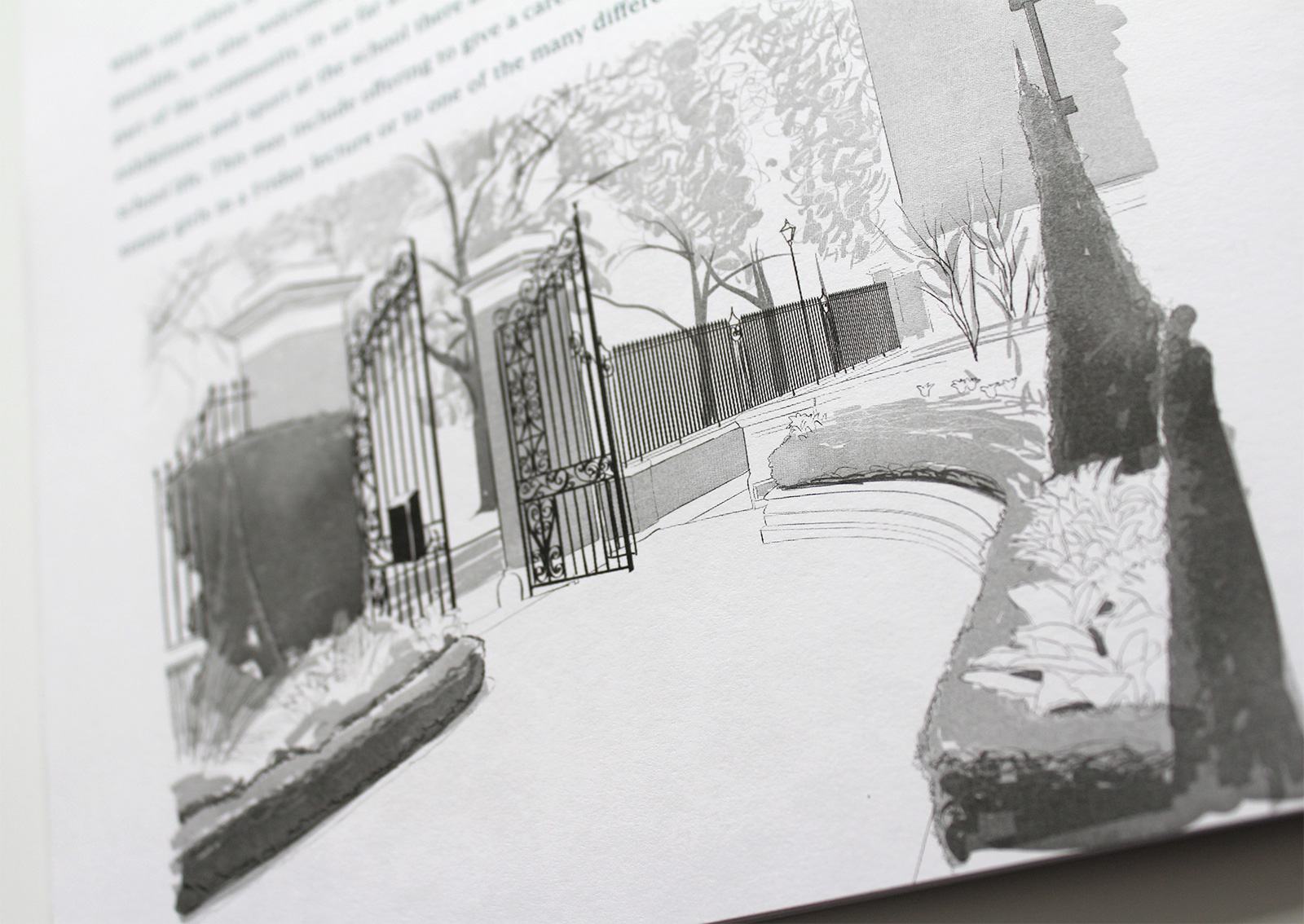
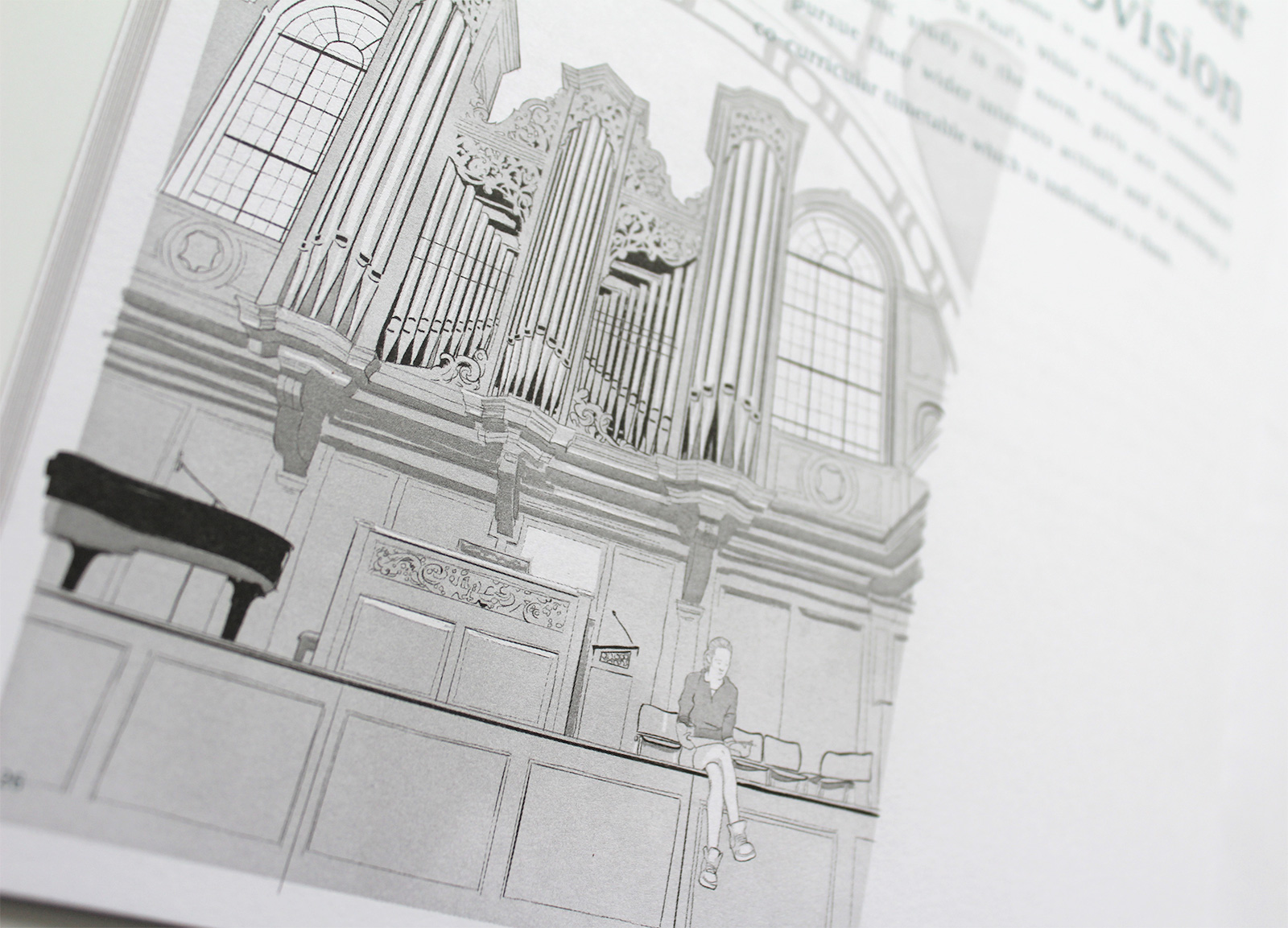
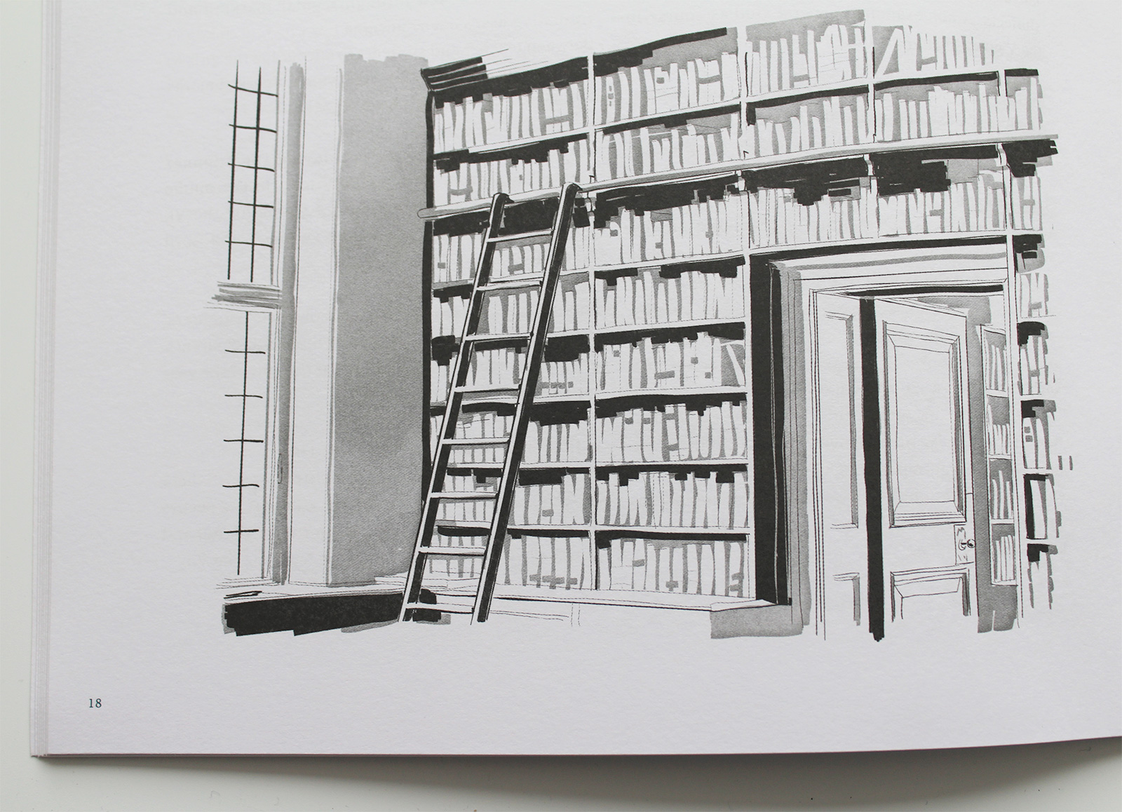
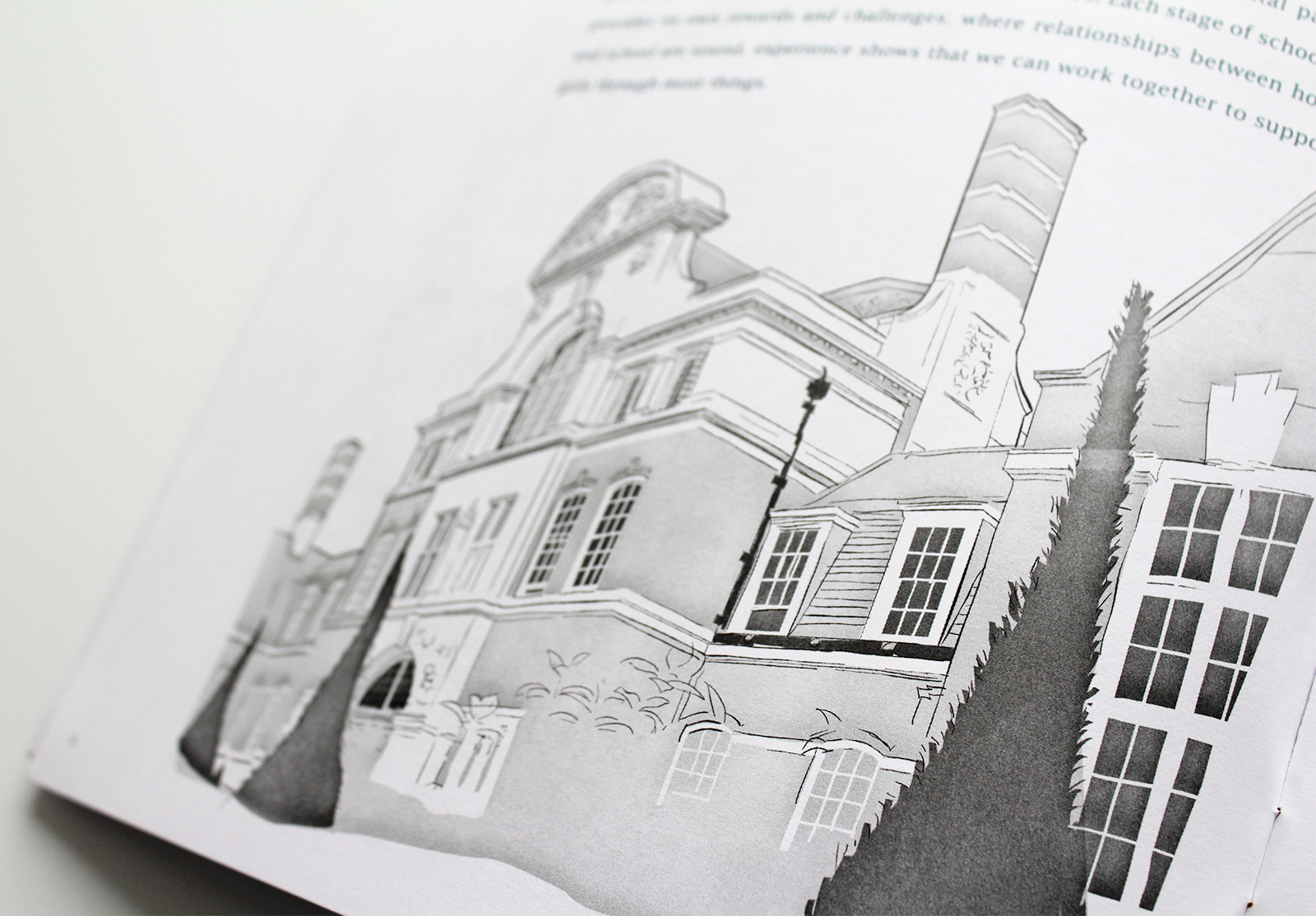
The handbook needed some imagery to break the columns of text so rather than include photographs which would have given the publication more of a prospectus feel, we illustrated architectural features. The parents were already very familiar with the school so illustrations offered a softer perspective.
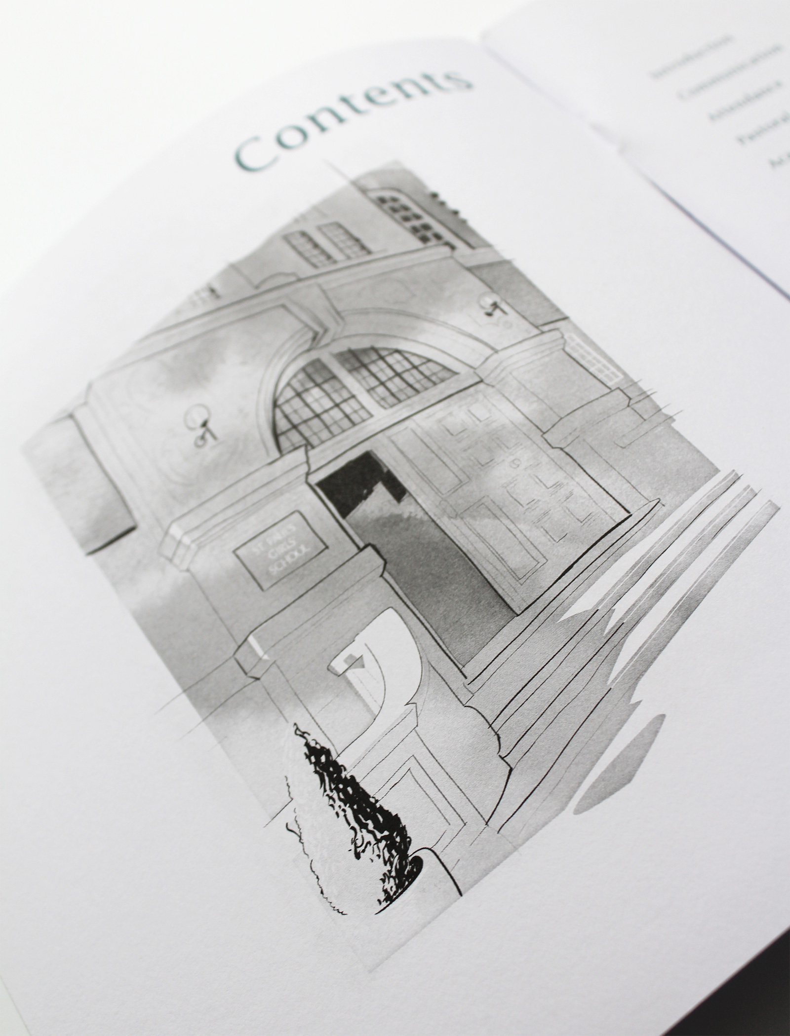
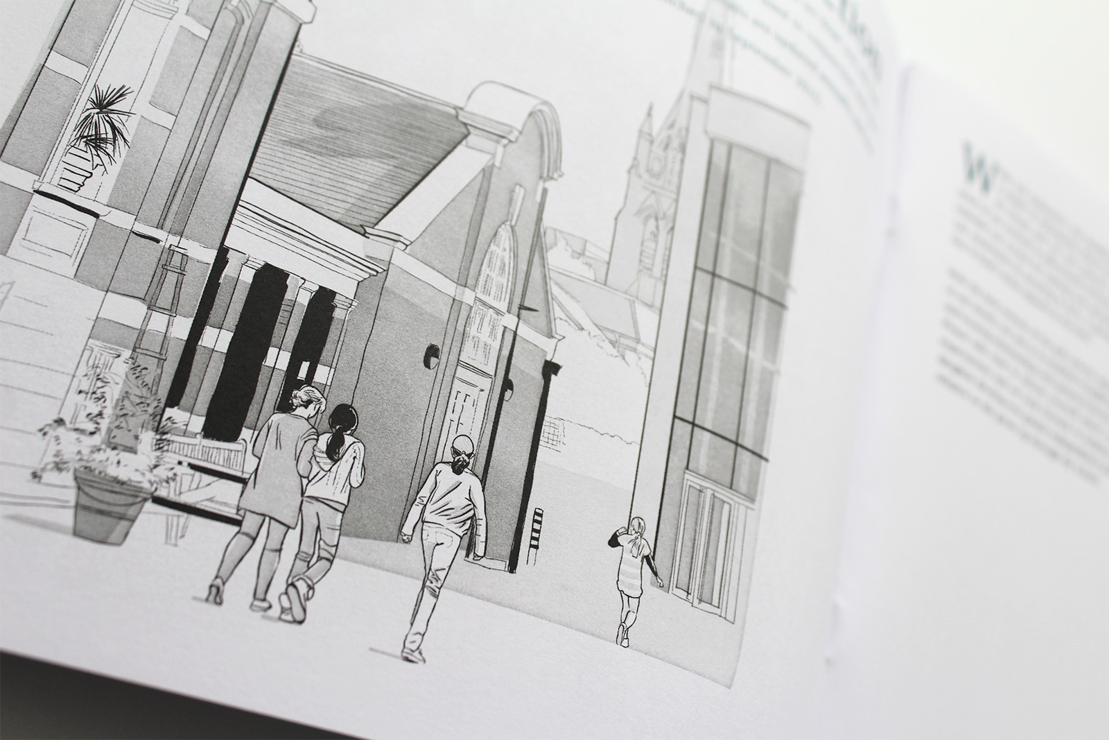
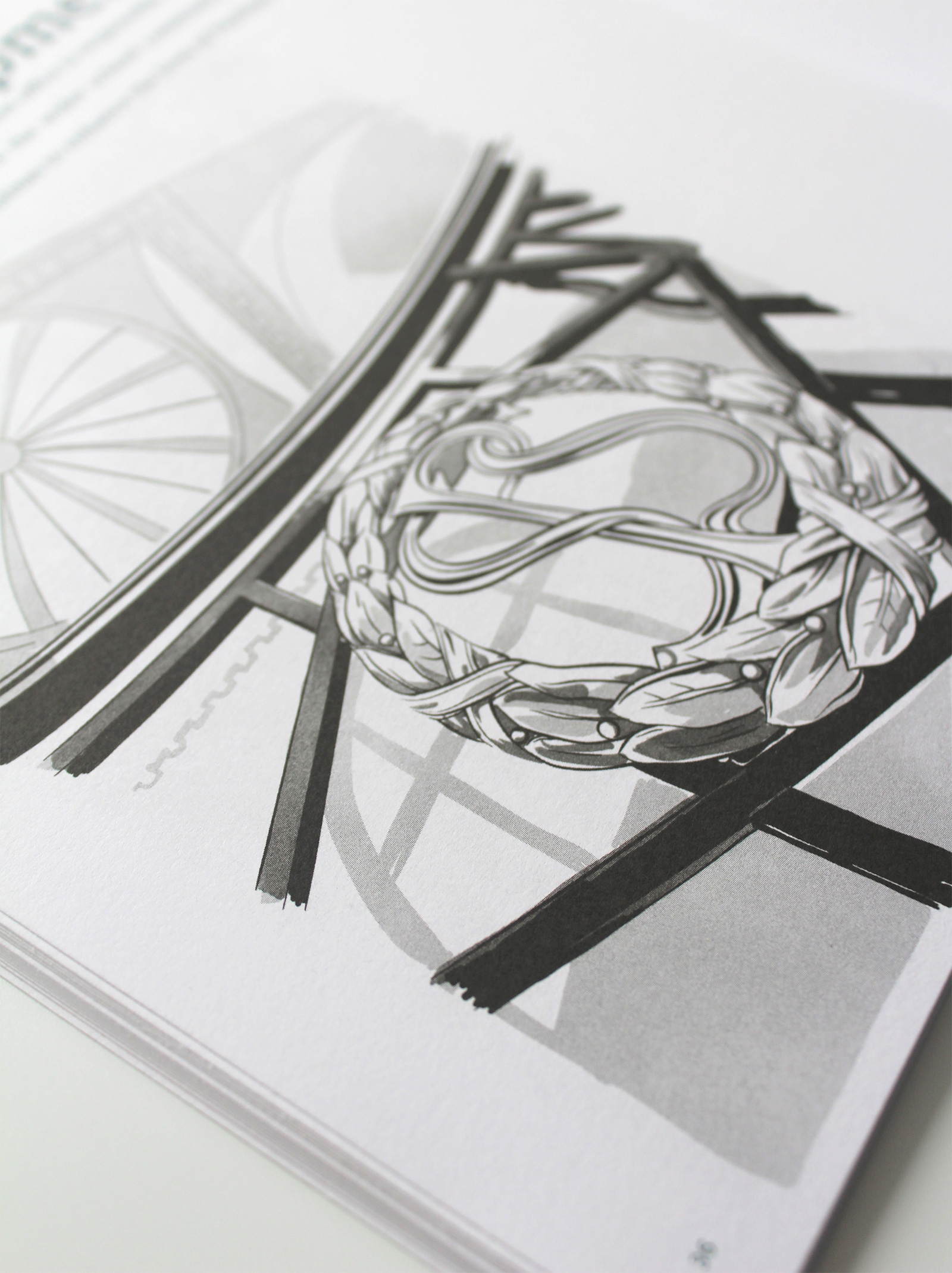
The final brochure was square and printed just two colours, black and a gentle grey/blue to mellow the visual tone and help the content to feel serious but modest.